Contact me through GalateaTen@aol.com

Showing posts with label Visual Art. Show all posts

Tuesday, July 16, 2013

MINI-CHAIR MINI-PAINTINGS by JEAN VENGUA!

Because I love the visual arts, I intersperse such throughout SitWithMoi.  Well, the poet and visual artist Jean Vengua made my day when she sent over these lovely 2" x 2" paintings!  Of chairs!!!! 


One is a cafe chair while the other is a rush chair.  Naturally, I have to shelve these lovelies somewhere -- so I did on  the "Tennessee Yellow Chair" which, whiile a mini-chair, is oversized for Jean's paintings!


Some of Jean's paintings, by the way, are available on Etsy.com.  And if you're interested in my personal engagement with her "haptic drawings," you can check out this article on OurOwnVoice.

Last but not least, I most definitely recommend Jean's poetry book, PRAU!

Maraming Salamat, Jean!  I will treasure these paintings always!


Monday, May 27, 2013

A DUSIE TROVE!

I've already written about the wonderful Susana Gardner and her fabulous global and often DIY publishing project, Dusi/e -- I wrote about it while discussing one of the Dusi/e publications, FLORULA LUDOVICIANA by Marthe Reed (so please go to Marthe's link). 

Well, I recently came across a piece of correspondence from years ago from Susana Gardner -- even the envelope is fabulous, isn't it!


The envelope had brought several goodies, including this wonderful collage by Susana:


Also in the envelope, however, were four small books whose sizes make them perfect for shelving into SitWithMoi's "Books on Chairs" project! 


What a trove!  Now, three of the books were blank -- which I used as prompts for making new mini-books (I will blog in the next post about "Made With Love," a poem I inscribed into one of the books.  Over time, I also will post about the other three.  Meanwhile, THANK YOU, Susana Gardner for your beautiful spirit and Dusi/e, still one of the most innovative and creative uses of technology -- a use of technology that in no way diminishes the role of the hand in creative art-making!

(Here is another SitWithMoi post on another Dusi/e project,  ALL THIS FALLING AWAY by Tim Armentrout.)


Friday, May 17, 2013

JAMES WESTWATER--ALSO A CHAIR ARTIST!

So, remember my post on mini-paintings interspersed with the mini-chairs and mini-books? Well, one of the featured artists, James Westwater, came across it and thought to share a work related to SitWithMoi's theme!  Here's a detail from his mixed media work, With Our Backs to the World, We Bow: The Hermeneutics of Solitude, 2013, 53 x 48 x 48 inches (and I LOVE that title!):


A man reading a book and 2 chairs!  Purrr-fect.  It's apparently on 1/35 scale, which must mean they're tiny!  The targeted chairs for SitWithMoi, by comparison, are 1/6 scale.  Anyway, here is the context for the above detail:


Nifty, eh?  But just when you think you know this work of art, look at the entire work!


The importance of context!  Thanks for sharing, James!  And do check out the artist's website for many more wonderful works of art, on chairs and otherwise!


Friday, March 22, 2013

A POET-PAINTER

is a favored breed by Moi.  And this reminds me that Moi's got chairs as not just chairs!  Here's a watercolor by Allen Bramhall that graces la casa:


I enjoy having this painting around and hope you, too, enjoy its image.  Last but not least, let this post be a reminder for Moi to point you to Allen's wonderful poetry which includes the magnificent two-volume DAYS POEM.  Allen also has an amazing and one of the most ambitious contemporary projects ongoing over at ANTIC VIEW with Jeff Harrison.  Check him out and enjoy!

Tuesday, March 19, 2013

PICASSO by DAVID HOCKNEY

I don't know why I've been so cursory in my attention to the small (generally 3" x 4") books put out by Hanuman Books.  On the few occasions that I've read books from these series, I've felt nothing less than awe.  Like, the 1990 PICASSO by David Hockney -- it is magnificent. 


On Picasso, Hockney has a beautiful mind!  Here are two favorite excerpts from this 2.75" x 4" book:

If we saw a dark void between ourselves and the world we would not put a foot forward. Essentially Cubism breaks down that obstructing wall, it breaks the window. Cezanne's cafe table is brought right up to your waist. You are more present in the work and the work in you. Cubism is about our bodily presence in the world.  It's about the world, yes, but ultimately about where we are in it. It's about the kind of perception a human being can have in the midst of living.

And also:  

Why would perspective occur in fifteenth century Italy but not be used by the Chinese, by the Persians, by the Indians, who were all very observant about nature and yet never used one-point perspective? The main image that was needed in the fifteenth century by the power that be -- the Church -- was a picture of the crucifixion to show the suffering of Christ for mankind. The earlier way it was done, by Giotto in the chapel in Padua, was to show it in a sequence. You follow a story in pictures where Christ carries the cross up the hill, stumbles for the first time, etc. But a crucifixion is an unusual form of execution because it contains no action You are literally nailed to a flat surface and you die, theoretically, because you cannot move. It is a slow expiration where the moment of life/moment of death would not be clear. It is not like being beheaded or having an arrow shot through your heart. Thus, because there was no action involved there would have been a special interest in making the picture with one-point perspective, where time has stopped and space is fixed. The game of fixing space results in a kind of solidity of feeling in the body.

The photograph is the ultimate perspective picture. The viewer is outside the picture and there is a vanishing point, and the vanishing point can theoretically be called infinity. If the infinite were God, the viewer and the infinite could have no connection whatsoever, and never can have any connection, so I assume that is the God that died at the end of the nineteenth century. When you reverse perspective, which is what Picasso did with Cubism, the viewer can see all sides of an object, has movement in space, and is everywhere at the same time. Infinity is therefor everywhere, including within the viewer. That actually sounds better to me, theologically.

I'm a big fan of cubism, which was a major influence on my first U.S.-published book, REPRODUCTIONS OF THE EMPTY FLAGPOLE (many of the poems were later re-printed in my Selected Prose Poems collection, THE THORN ROSARY). My version of cubism for this collection of prose poems was writing poems where the paragraphs could be re-ordered than from the orders presented in the book.  Thus, I had to tinker with the language to make them sufficiently abstract so that they'd still generate sense in new orders.

So where shall we "shelve" then this lucid, visionary book?  Well, but of course: on the chair meant to hold ... light!


Anyway, I have two other Hanuman Books that soon shall join SitWithMoi's "Books on Chairs" collection.  I really should look for more ...


Saturday, March 16, 2013

BLUE BLEU BLU by ALICE BRODY

[Related Post: JAPAN TALES by Alice Brody]


I'm so pleased to share that New York-based quiltmaker Alice Brody has sent SitWithMoi a second mini-book!  It's entitled BLUE BLEU BLU and, as you might infer, its theme is the color blue!


There are so many lovely elements to this enchanting 2" x 2.25" book.  First, there's just the craftsmanship of it, which includes a blue board backing to the covers and side-ties:


As you page through the book, you'll see the many ways Alice explores the blue theme.  What's great is how her explorations are not just variations of the color but "riffs" off of the theme.  Thus, some of the pages are not just cut-outs from applicable fabrics but fabrics with glued-on designs.  Let's page through the book:


As you see, Alice is not letting the color be a constraint.  She's allowing herself to freely roam offa da blue pasture.  In a way, it reminds me of a book I once reviewed, RED by Marilyn R. Rosenberg, that explored red-ness.  By not sticking to their respective colors, Alice actually heightens blue-ness as Marilyn does red-ness.  The effect is lush and resonant.  Here are more pages from Alice's book:


The immediately preceding image above shows the center pages.  This could mean that the rest of the pages are just doubles, except that subsequent pages get more treatment by Alice (addition of extra material) so that they are not repetitious:


I also adore Alice's "diction" as regards the different types of fabrics and materials so as to imbue the pages with extra dimensions viz surface and tactility, as with the furry thread on the following:


All in all, the mini-book provides for a delightful experience.  One can return to it more than once and receive a variety of joyful engagements.  Here's what it looks like as a closed volume:


And as regards where to "shelve" this book, I'm pleased with the synchronicity that Alice chose to explore blue versus another color.  Because it is exactly the book to elevate this blue, painted chair that I only found "charming enough" by itself.  That is, while I appreciate the chair, I thought it needed something extra.  Now that Alice's BLUE BLEU BLU is shelved atop it, I think the sum is greater than the combination of its parts (1+1=more than 2).


Here's the first time I can say about a chair-and-book combination, that one rose up to the level of the other.  Thank you, Alice Brody.

Wednesday, March 13, 2013

WE INTERRUPT OUR REGULAR PROGRAMMING TO BRING YOU ...

Moi is helpless against our buddy Art.  So, I wanted art interspersed among the mini-chairs.  Entonces, I scoured la casa  for items that would fit SitWithMoi's mini-scale and, ta-dah: art!  Mostly paintings, a medium Moi loves.  Shall we take a tour?


First, we are lucky to have two evocative works by Mark Mulroney:

Philip The Arabian First Half of the III century AD


2005 


Then we are lucky to have a lyrical painting by Thomas Fink:

"Banned in Port Jefferson" (2004)


Then we are lucky to have (on top shelf) two witty matchbox paintings by James Westwater:


Then we are lucky to have two 2011 diptychs of "Bogota" by Colombian painter Winston Portela:


Then we are lucky to have a hay(na)ku collage by Amanda Laughtland (which she'd sent over as a note and which I recontextualized for SitWithMoi):

 A guest in
the country
I

see the stars
through the
trees


Last but not least, we are lucky to have some items that I'd picked up two years ago at a fundraiser for Haiti, "Hearts for Haiti" at Napa's Blue Oak Middle School:


And when I want to contemplate them all, I do so sipping a cuppa java that I can place on some Charles and Ray Eames chair mug pads!  (Picked up a few years back from MoMA, NYC store):


Hope you enjoyed the peek behind-the-scenes.  And, yes, I'm always looking for mini-art as well ...

Tuesday, March 12, 2013

5 SKETCHES by ED BAKER

[Related Post: THE FIRST STONE GIRL by Ed Baker] 


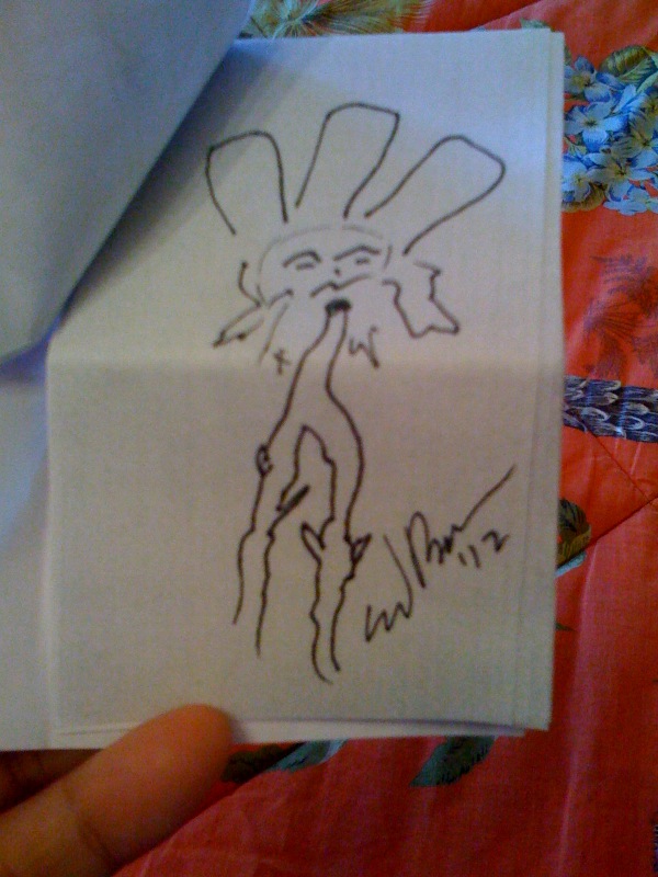
One of SitWithMoi's most popular posts is the one I did on Ed Baker's THE FIRST STONE GIRL, so do click on the above link if you missed it.  Meanwhile, I'm pleased to have a second mini-book by Ed -- well, actually, it's one I "edited" on his behalf: 5 SKETCHES by Ed Baker.  It all began when Ed emailed me a page with five sketches:


Looking at the size of the sketches, I had the idea of creating a mini-sketch book.  So I did!  And for its cover, I printed out a black-and-white version of one of Ed's drawings:


I did black-and-white to evoke the sketching process as drafting process, not a finished product.  I cut up the black-and-white print-out to create the cover:


Here's the cover below, and then what you see when you first open the 2" x 2.75" sketchbook...and, yes, I was quite pleased at being able to integrate the original signature onto the title page as the author's byline:


I decided to use turquoise ink to write the title as I didn't want to stick to pure black-and-white as so much of Ed's work is colorful.  Anyway, you then would turn the pages to see Ed's five sketches:


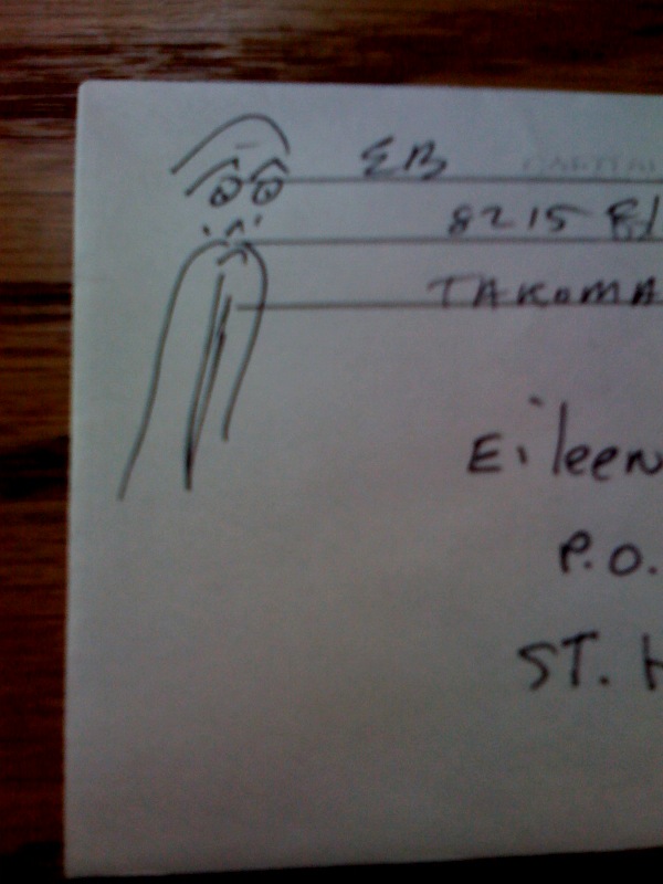
A lotta fun to unfold.  Thanks, Ed!  Ed says he often makes sketches like these, probably every day.  And I believe it because I received a new mini-book by him (BETWEEN TWO HOUSES which shall be the subject of a future post) and here's what he drew on the envelope:


It must be how the work infiltrates your mind if you're an obsessive artist (and most artists and poets are obsessive) so that, for Ed, he just keeps sketching/doodling. Coz that's what he does: makes visual art!  It's like, as I sit here writing up this post, my eyes keep straying to the box of kleenex on the left corner of my desk


and I keep thinking, Ya know -- that Kleenex box would create a good mini-book cover ...

Chuckle ...

Anyway, so where shall we "shelve" Ed's mini sketchbook?  But of course on the sidetable that came with Mary Scheller's chaise lounge, because the chaise lounge features Ed's other publication, THE STONE GIRL!


You can now relax with both publications in hand!  As you look about for who'd serve you a salt-rimmed margarita, that is ...